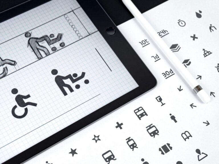
Icons are tiny little symbols that manage to say so much by showcasing so little. Some are so universal that it does not take us even a minute to recognize that they represent a particular brand, product, or image. According to Medium, icons are majorly representative of how users navigate through software or web pages. Whether you aspire to become a UI designer or are a UX designer who wants to brush up their design skills, having an idea about the icon designing process is essential. This article will cover a step-by-step guide on how you can create an icon from scratch and the rules you need to follow in the designing process.
Designing an Icon – A Step-by-Step Manual
Designing an icon requires design software with all the features and functionalities needed to create a full-fledged icon. Various designing applications are available to facilitate making icon packs, fonts, and even logos. One such application is Glyphs Mini. It allows its users to create fonts, icon sets, and logos with finesse. In addition, it offers precise vector editing and other useful features that make the designing process smooth and easy. Moving on, here are the steps involved in creating an icon from the ground up.
Step 1 – Have an In-Depth Knowledge About Your Subject
Being familiar with the design subject is crucial in creating a suitable icon. Therefore, we will be taking a camera as the design subject to explain the process. A camera features the following characteristics:
- A massive lens in the middle of its framework.
- A flash.
- A button that helps in capturing a shot.
Now that you know what representative features your icon needs, you can include their design cues in your icon to ensure that it gets easily recognized by the target audience.
Step 2 – Break Down the Subject into Basic Shapes
Now that you know what the icon’s design should look like, break the subject into a simpler form by determining what shapes are used. Think whether there are any circles, triangles, or squares involved. You could simplify the process by roughly sketching the design subject and analyzing it. In the case of a camera, the body can be represented by a round rectangle, the lens, and the flash by circles, and a rectangle can portray the clickable button. These shapes will be the building blocks of your icon.
Step 3 – Begin Designing
With all your information regarding the design cues and shapes, you can move to your system and start designing. First, create a board, name it “Camera,” and switch to Pixel grid mode. Now, start drawing the basic shapes and ensure that they fit perfectly in the grid. Sometimes, pixels do not snap perfectly to the grid. If that is the case, adjust your border settings. Finally, combine the basic shapes to get the desired result.
Step 4 – Get Feedback
The only way to truly ensure whether a design is working out or not is to share it with another individual and get honest feedback. Therefore, when you are done designing the logo, share it with a co-worker or an experienced friend. Inquire whether they see a camera when looking at the icon or not. If they say no, the icon still requires some work.
Step 5 – Provide the Finishing Touch
Once you are done with the designing part, inspect the icon from top to bottom and search for any inaccuracy that may have been left unchecked. Also, re-check the icon for decimal points. Then, check whether the numbers in the inspector are whole or not. If everything is okay, finish up and move on to the final step.
Step 6 – Export the Icon
Save the final version of your icon and export it. This was just a simple camera icon that we have discussed. You can always make your icon more complex in terms of design and style if you want. Irrespective of how complex or straightforward an icon is, the designing process and the key factors always remain the same.
Rules You Should Keep in Mind While Designing an Icon:
Here are some rules which you should always follow while designing an icon:
- While designing, keep the grid’s alignment in mind. Pay close attention to how your icon fits in the pixel grid.
- Do proper research before starting to design any icon. Look around for references and design cues.
- While designing, do not get too invested in the minutest details. Be strategic regarding the attributes you wish to include.
- While designing a set of icons, be consistent with the styling choices. Make sure that consistency is maintained throughout the pack.
Designing an icon is not a gruesome task, especially if you know your way around designing software and the basics of designing. Just be mindful about employing tactics, and the end product will surely be a satisfactory one.

